El Beneficio de la Duda
Service
Logotypes
Field
Coffee production
A family-owned coffee company with newly diversified and developed farms wanted to take the first steps to become a group of brands that could equally represent the identities of the Salvadoran farms, along with their family history and their sustainable and ecological methods.
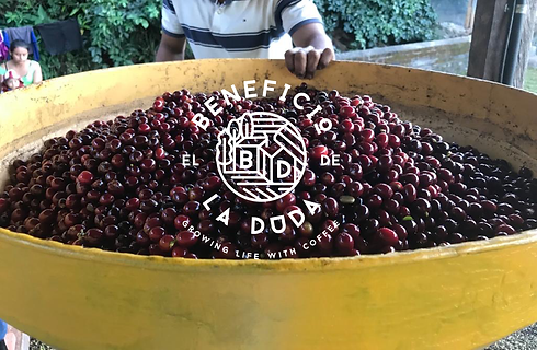

We wanted to create the idea of community, the place where it all comes together.
Approach:
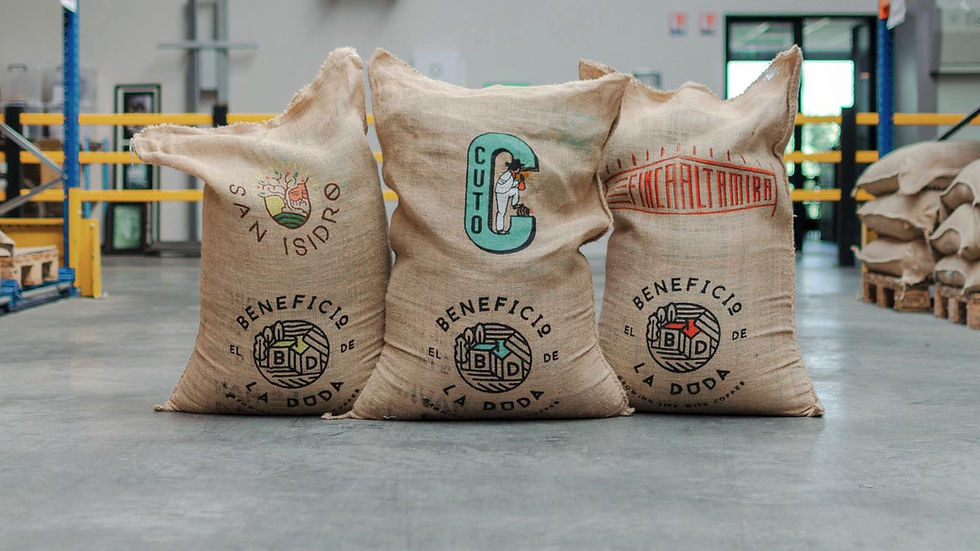
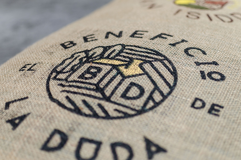
El Beneficio de la Duda is the place that ties together farms and communities along with their brands. This is the place where green coffee gets processed and prepared for toasting. With this in mind, we wanted to create the idea of space and community, where it all comes together.
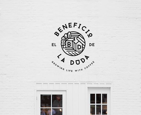
So we represented it with a house, using the acronyms B & D, the trees, the mountain, and the coffee drying fields into a clean and simple logo that could be used together with the others and in different applications.
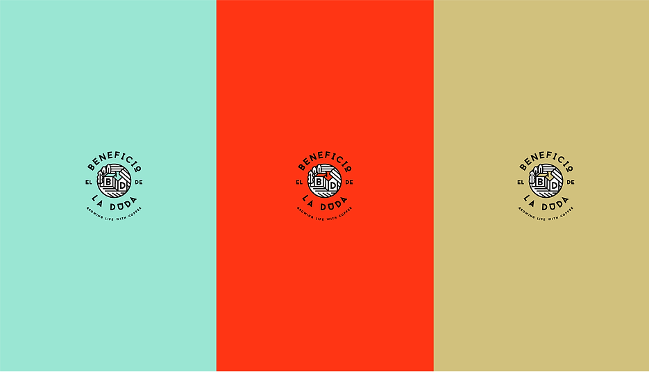
To create a connection as a family, we correlated it with the other logos creating a code of three different mute colors which reinforced the idea of community.
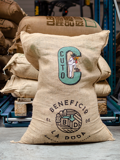

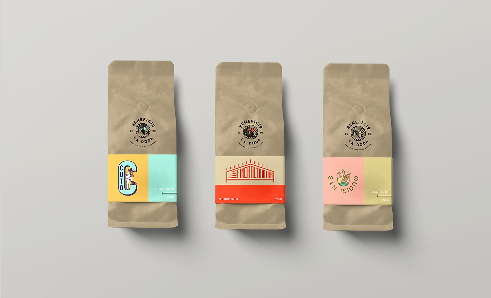
El Cuto is a local Salvadoran tale represented using the style of local signs made by hand.
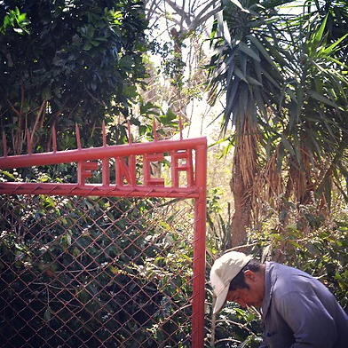
The welcoming gates of Finca Altamira are represented in the logo.
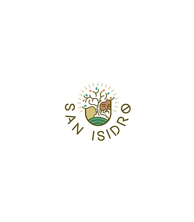
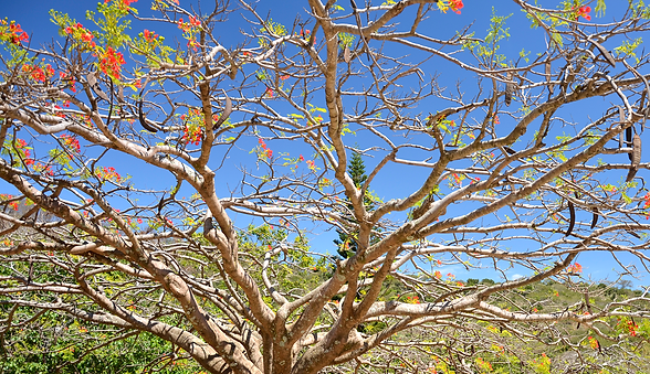
San Isidro represents the Saint and the iconic “tree of fire” that stands tall in the farm.
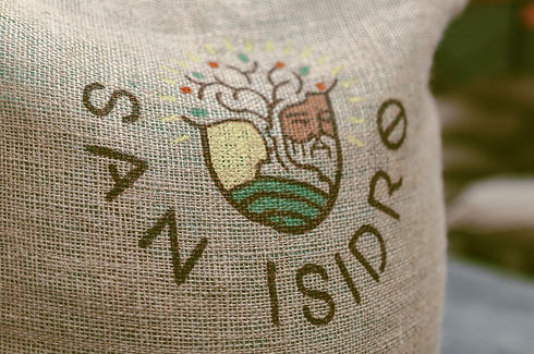
The three sub-brands have their own personalities in the same way the types of coffee do, representing different stories related to the history of the farm and Salvadoran local tales. Finca Altamira has renowned gates that welcome all to the farm which we brought to the forefront of their identity in their logo. El Cuto, is a local Salvadoran tale represented using the style of local signs made by hand, and finally, San Isidro represented by the Saint and the iconic “tree of fire” that stands tall on the farm. All were immediately unique logos that the locals could be proud of.
Result:
These logotypes have given an easily recognizable and local face to their brand identity. The new logotypes have allowed them to sell their green coffees and create meaningful contracts with big distributors in Europe. Making them seen, be recognizable, and trustworthy.


