Alba
Service
Field
Brand Heart, Brand messaging, Identity, Logo, Illustration, Print, Web
Food marketing
Emmanuelle, the owner of Alba approached us to create the foundations of her new company’s brand identity specializing in food marketing. We worked from Analysis, Foundation, to Creation.
Check the work:
albafoodmarketing.com


The approach
1.Analysis
To identify the value proposition we started by analyzing Alba's competition and identifying the profile of their marketing personas.
2. Foundation
We got into the smallest details to build on the brand personality as a whole, reviewing each step of the way. We worked on the heart of the brand reevaluating its mission and vision and giving it a voice to clearly portray the brand's intentions.
With empathy as the core value, we created a brand that works as a friend to the audience and a guide to their potential customers.
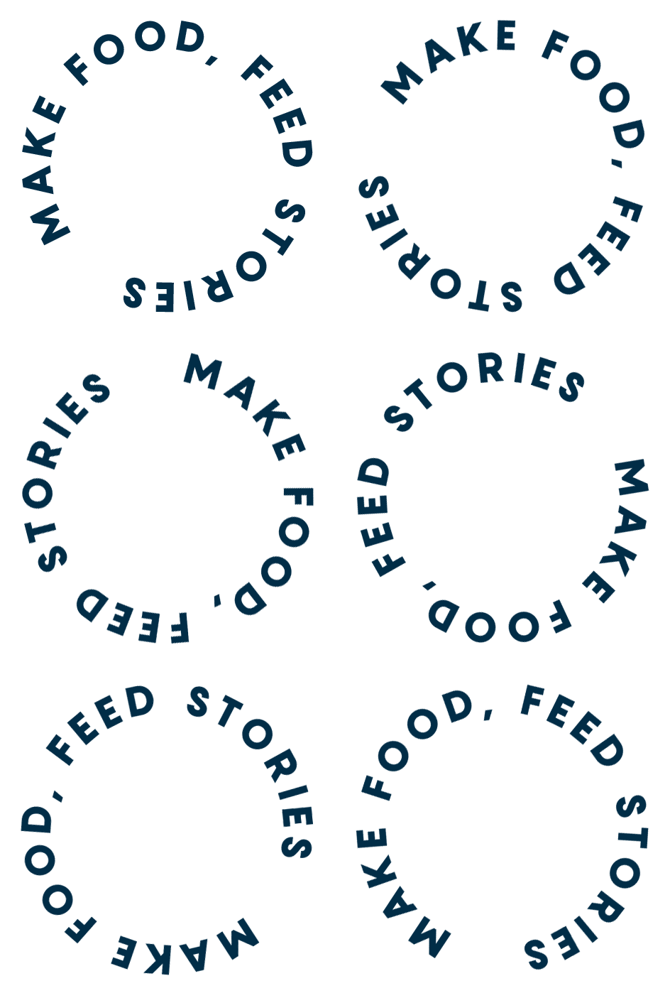
This brought us to the slogan - Make food, feed stories - appealing to both Alba’s and the customers' main value.


3. Creation
Once we built the foundations and gave soul to the brand, we began with the logo. Alba - meaning “dawn” in Spanish, was the perfect visual metaphor to represent this brand so we made it a center point of the logo.
From dawn to dusk, Alba guides food brands from the moment of their conception to their peak of splendor and keeps them shining for a long time. The logo plays with the circular shapes of the sun, from "a" to "a", representing its trajectory movement, from when it rises until it hides.
The idea was translated into the illustration design that completes the brand and its web design which is seen as the main tool of the first contact in the company.


