Hopen
Service
Field
Brand Strategy, Brand Identity, Brand manual, Infography, Illustration, Web design
Agricultural,
Food & Beverages
Hopen, a French hops company that supports the production and marketing of local, organic, and sustainable hops, partnered with Alba Food Marketing and our team to clarify and amplify its brand image. Our goal was to better represent Hopen's uniqueness and expand its leadership in the industry.


The approach
1. Analysis / Brand Positioning
We conducted an analysis of Hopen's competition and performed a SWOT analysis to identify the company's unique attributes and positioning. Our team worked with Alba Food Marketing to create a brand strategy that would give Hopen a unique voice and help the company build a community.
2. Creation of Brand Identity
Our team created a graphic style that centered around sustainability, with "fresh, local, and sustainable" as the guiding principles. We used warm, natural colors and illustrations to create a warm and accessible identity that instantly conveys a feeling of well-being and maturity.
To showcase Hopen's commitment to the people who contribute to the company's success, we created a photographic style that features real people and daily actions. We also took product photography into account to present the different product varieties.
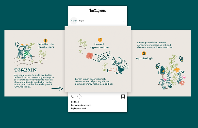
Illustrations were essential in helping readers spot and understand key points, while infographics made technical processes easy to understand. We created a series of illustrations to represent the brand's main value propositions, as well as icons to represent different specifications and flavor profiles.
The 'sketch' style we used for the illustrations exudes an artisanal feel that aligns with the culture of hops and the artisanal process of beer. The typography merges with natural colors and organic illustrations to create a cohesive and memorable brand identity that ties together the themes of "fresh, local, and sustainable".
UI
As a part of our comprehensive brand identity system development for Hopen, we also proposed the design system for the user interface (UI) of their website. Our design process involved creating a cohesive look and feel for the website, including developing customized icons, fonts, and layouts to effectively present the brand's products and messages.
Utilizing a combination of illustration, photography, and typography, we developed a compelling brand story that resonates with Hopen's target audience. Our website design approach prioritizes the user's journey, ensuring that the website is intuitive, easy to navigate, and aesthetically pleasing.
In addition to the website design, we also developed a series of eye-catching social media post layouts that align with the brand's visual identity and messaging.